
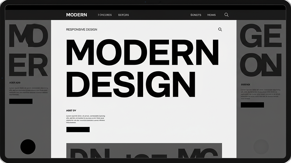
Master Responsive Website Design Essentials
- Dejan Medakovic
- May 26
- 4 min read

Building a website that looks great and works perfectly on every device is no longer optional. It’s a must. Whether you’re launching a startup or running a small business, mastering responsive website design essentials can make or break your online presence. I’m here to walk you through the key steps to create a site that’s flexible, user-friendly, and downright impressive.
Why Responsive Website Design Essentials Matter
Let’s face it: people browse the web on all kinds of devices. Smartphones, tablets, laptops, desktops - you name it. If your website doesn’t adapt smoothly to different screen sizes, you risk losing visitors before they even see what you offer. Responsive design ensures your site looks sharp and functions flawlessly, no matter the device.
Here’s why it’s crucial:
Improved User Experience: Visitors stay longer and engage more when your site is easy to navigate.
Better SEO: Search engines favor mobile-friendly sites, boosting your rankings.
Increased Conversion Rates: A seamless experience encourages users to take action, whether it’s buying, signing up, or contacting you.
Think of responsive design as your website’s way of saying, “I’ve got you covered,” to every visitor.

Core Principles of Responsive Website Design Essentials
Getting responsive design right means focusing on a few core principles. Nail these, and you’re well on your way to a site that shines.
Fluid Grids and Flexible Layouts
Forget fixed widths. Use fluid grids that resize based on the screen. This means your content flows naturally, adjusting to fit any device. CSS Grid and Flexbox are your best friends here. They let you create layouts that rearrange themselves without breaking.
Flexible Images and Media
Images should scale with your layout. Use CSS properties like `max-width: 100%` to ensure images don’t overflow their containers. Also, consider modern formats like WebP for faster loading. Don’t forget to optimize file sizes to keep your site speedy.
Media Queries
Media queries are the magic behind responsive design. They let you apply different styles depending on the device’s screen size, resolution, or orientation. For example, you might stack columns on a phone but display them side-by-side on a desktop.
```css
@media (max-width: 768px) {
.sidebar {
display: none;
}
}
```
Touch-Friendly Elements
On mobile devices, users tap instead of click. Make buttons and links large enough to tap easily. Add enough spacing to prevent accidental clicks. This small detail makes a huge difference in usability.
Performance Optimization
Responsive design isn’t just about looks. It’s about speed too. Compress images, minify CSS and JavaScript, and leverage browser caching. A fast site keeps visitors happy and improves your SEO.
Designing for Different Devices and Screen Sizes
Responsive design means thinking beyond just desktop and mobile. Tablets, large monitors, and even smart TVs come into play. Here’s how to approach it:
Start with Mobile-First
Designing mobile-first means you build your site for the smallest screen first, then scale up. This approach forces you to prioritize content and functionality, ensuring a clean, focused experience.
Define Breakpoints Strategically
Breakpoints are where your design changes to fit different screen sizes. Common breakpoints include:
320px - small phones
480px - larger phones
768px - tablets
1024px - small laptops
1200px+ - desktops
Don’t just rely on device sizes. Look at your content and decide where it needs to shift for the best experience.
Test on Real Devices
Emulators are handy, but nothing beats testing on actual devices. Check how your site looks and feels on various phones, tablets, and desktops. This hands-on approach helps catch quirks and usability issues.
Tools and Techniques to Master Responsive Website Design Essentials
You don’t have to go it alone. Plenty of tools and techniques make responsive design easier and more efficient.
Frameworks and Libraries
Frameworks like Bootstrap and Foundation offer pre-built responsive grids and components. They speed up development and ensure consistency. But don’t rely on them blindly - customize to fit your brand and needs.
CSS Grid and Flexbox
These CSS modules give you powerful layout control. Grid is perfect for two-dimensional layouts, while Flexbox excels at one-dimensional alignment. Mastering both lets you create complex, responsive designs with less code.
Responsive Typography
Text should scale smoothly across devices. Use relative units like `em` or `rem` instead of fixed pixels. CSS clamp() is a game-changer, letting you set minimum, preferred, and maximum font sizes in one line.
```css
font-size: clamp(1rem, 2vw, 1.5rem);
```
Image Optimization Tools
Tools like ImageOptim, TinyPNG, or online converters help reduce image file sizes without losing quality. Combine this with lazy loading to speed up page loads.
Browser Developer Tools
Chrome DevTools, Firefox Developer Edition, and others let you simulate different screen sizes and debug responsive issues in real-time. Use them often to fine-tune your design.
Practical Tips to Boost Your Responsive Website Design Essentials
Here are some actionable tips to elevate your responsive design game:
Keep Navigation Simple: Use hamburger menus or collapsible nav bars on small screens.
Prioritize Content: Show the most important info first. Hide or move less critical elements on smaller devices.
Use Scalable Vector Graphics (SVGs): They look crisp on all screens and scale without losing quality.
Avoid Fixed Position Elements: They can cause layout issues on small screens.
Test Load Times: Use tools like Google PageSpeed Insights to identify bottlenecks.
Incorporate Accessibility: Ensure your site is usable for everyone by following WCAG guidelines.
Remember, responsive design is about flexibility and user focus. Keep iterating and improving based on feedback and analytics.
Taking Your Website to the Next Level
Responsive design is just the start. To truly stand out, your website needs personality and purpose. That’s where a strong brand identity comes in. A well-designed, responsive site paired with a memorable brand creates trust and drives engagement.
If you want to partner with experts who understand the unique challenges startups and small businesses face, check out maestromedak. They specialize in crafting websites that not only look amazing but also deliver results.
Mastering responsive website design essentials sets the foundation. From there, you build a digital presence that grows with your business and wows your customers every step of the way. Dive in, experiment, and watch your online impact soar!


Comments